Emoji reactions
Long-press a message to open a quick emoji picker; selected reactions render as pills in the bubble and toggle on tap. The bar's chevron opens the built-in full emoji grid (search, tabs, recents) in place; both ship in the core with no extra dependencies, and renderExpandedPicker / renderReactionPicker replace them.
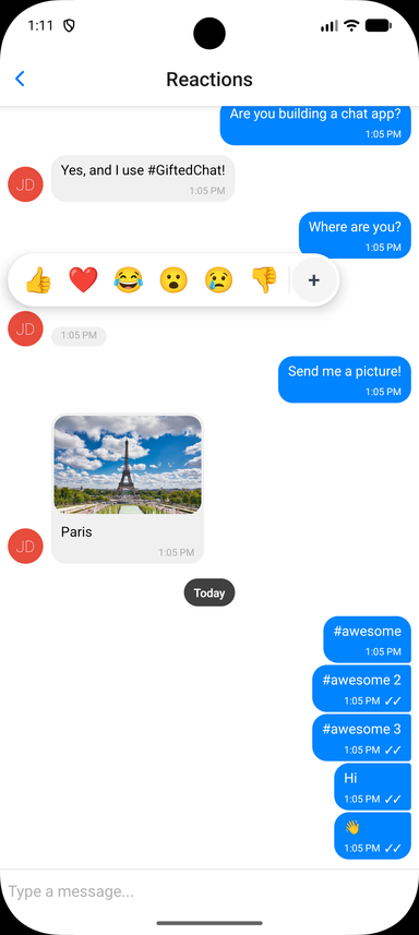
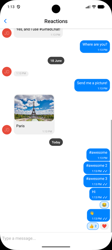
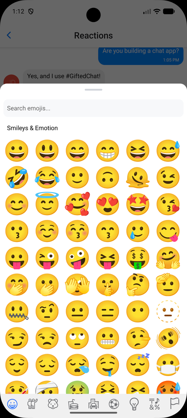
Wiring up the toggle, and the full prop list
Store reactions on each message as a reactions array and pass reactions.onReactionPress - that alone turns reactions on. Chat.toggleReaction(messages, messageId, emoji, userId) is the reducer, so the handler is one line. Reaction state is owned by you, so it works with any backend:
interface IChatMessage extends IMessage {
  reactions?: MessageReaction[] // { emoji: string, userIds: (string | number)[] }[]
}

const CURRENT_USER_ID = 1

const handleReactionPress = useCallback((message: IChatMessage, emoji: string) => {
  setMessages(prev => Chat.toggleReaction(prev, message._id, emoji, CURRENT_USER_ID))
}, [])

<Chat
  messages={messages}
  onSend={onSend}
  user={{ _id: CURRENT_USER_ID }}
  reactions={{
    onReactionPress: handleReactionPress,
    // Optional: provide a richer picker (e.g. a full emoji browser).
    // See example/components/chat-examples/ReactionsExample.tsx
    // renderReactionPicker: props => <MyEmojiPicker {...props} />,
  }}
/>
Chat.toggleReaction (also exported as toggleReaction) returns a new array and leaves other messages untouched. A user can leave up to three different reactions on a message by default, as in Telegram - a fourth replaces their oldest; pass { maxPerUser: 1 } as a fifth argument for one reaction each, or any other limit (Infinity for none).
For a prototype, useChatMessages({ initialMessages, user }) keeps the messages in local state and returns chatProps wired to sending, reactions, editing and deleting: <Chat {...chatProps} />.
Reactions Props (Grouped)
-
isEnabled(Bool) - Enable emoji reactions; default is on wheneveronReactionPressis passed -
emojis(String[]) - Emojis shown in the quick picker (default['👍', '❤️', '😂', '😮', '😢', '👎']) -
onReactionPress(Function) -(message, emoji) => voidcalled when an emoji is selected or a pill is tapped. Apply it withChat.toggleReaction -
getUser(Function) -(userId) => User | undefined, who reacted. As in Telegram, a pill shows up to three reactors' avatars instead of a count in a one-to-one chat, and in a group while the message has three reactions or fewer, when every reactor is known. Defaults to the senders of the loaded messages (and you) -
renderReactions(Function) - Override the reactions-display component rendered below the bubble -
renderReactionPicker(Function) - Override the picker shown on long-press (use for a full emoji browser). It receivesReactionPickerProps:visible,message,emojis,onSelect,onDismiss,position, the bubble's on-screen box (pageX,pageY,bubbleWidth,bubbleHeight), the two picker styles and:reactionTarget({ x, y }, optional) - Where the picked reaction's pill is, relative to the bubble's box, once the pick has been applied and the pill drawn. Pass it on toContextMenuso the pick flies to its own pillmessagePreview(ReactNode, optional) - A copy of the pressed bubble to draw lifted above your backdrop at the bubble's box. While it is mounted the original bubble is hidden, so the message seems to rise out of the list; if you never render it, the original simply stays put. The easiest way to get the built-in look is to render the exportedContextMenuwithitems={[]}(see Message actions for its props)
-
renderExpandedPicker(Function({ onSelect }) | null, optional) - The expand button. The reactions bar (in the quick picker and above the context menu) ends in a chevron that grows the bar in place into a panel holding what this returns. Defaults to the built-in emoji grid (8 columns, search, tabs, recents); pass your own, ornullto drop the button. CallonSelect(emoji)with the pick; the overlay closes andonReactionPressis called. Also passed to a customrenderReactionPicker -
renderReactionIcon(Function({ emoji, place, size, color, isChosen }), optional) - Draws a reaction as an icon instead of its emoji text, everywhere a reaction shows: the pills on a message (place: 'pill'), the reactions bar of the long-press overlay ('picker') and the pick flying from the bar to the message ('flight').emojiis the reaction's key,sizethe emoji's font size there (16 in a pill, 26 in the bar),colorthe text color there, andisChosenis true for the current user's own reaction. Returnnullto keep the text for a key. With it,emojisandMessageReaction.emojican hold keys of your own ('like','question') drawn with your icon set; the built-in emoji grid behind the chevron still shows emoji, so pair it withrenderExpandedPicker: nullwhen only your keys are allowed. Also passed to a customrenderReactionsandrenderReactionPicker, andReactionIconis exported for drawing a reaction the same way in your own components:import ThumbsUp from 'lucide-react-native/icons/thumbs-up'import Heart from 'lucide-react-native/icons/heart'const ICONS = { like: ThumbsUp, love: Heart }<Chatreactions={{onReactionPress,emojis: ['like', 'love'],renderExpandedPicker: null,renderReactionIcon: ({ emoji, size, color, isChosen }) => {const Icon = ICONS[emoji as keyof typeof ICONS]return Icon ? <Icon size={size} color={color} fill={isChosen ? color : 'none'} /> : null},}}/>See
example/components/chat-examples/ReactionIconsExample.tsx -
containerStyle,reactionStyle,reactionActiveStyle,reactionTextStyle,reactionCountStyle- Styles for the reaction pills -
pickerContainerStyle,pickerEmojiStyle- Styles for the quick picker